Have you heard about typography?
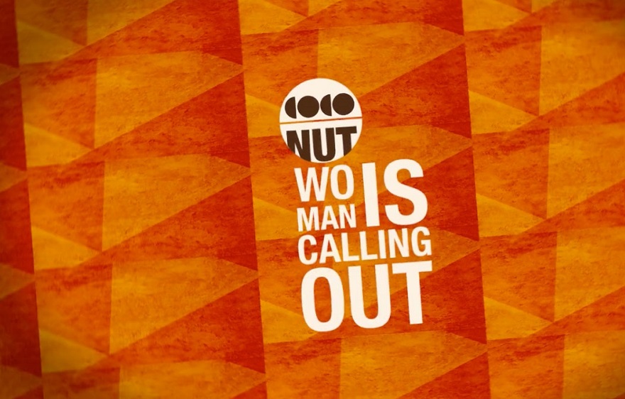
Typography is a group of characters such as letters, numbers, or other elements that share the same design. It is now used to create posters to offer a different way of advertising a brand or a product.
Typography pulls out different vibes to grab the attention of someone by using inspiring words and meaningful sayings. If the quotation is attractive, the design should be minimal. Typography posters can pull-out a big impression on the audience.
Basic typography designs are often overlooked art. So, if you want to make eye-catching marketing posters, you’ll need to have some background knowledge about typographic design ideas.
Are you looking for an online poster designing tool
Essential Tips to Create a Typography Posters
Follow the below tips to make stunning and visually perfect typography posters.
Typography Posters Should Be Clear
For the posters to be attractive and readable, the design should be bright. Do not use multiple fonts on the same poster. If you use many fonts, the result will only create confusion for the readers. As much as possible, follow a single or two different fonts on the poster.
Also, don’t use fancy and cutesy fonts unless you have reasons to utilize them. It is advisable to always go for a regular and simple font of your choice. If you’re curious on how to make a typographic poster, use Times New Roman and Helvetica as your primary font.
So if the heading is bold, different font size and text dimensions were utilized, the output will be clean, effective, and simple. Also, avoid using multiple colors. It is advisable to use at least one to two colors to make it as simple as possible.
Serif and Sans-Serif
In case you’re not aware of “serif,” it’s now the right time to be knowledgeable about fonts.
A serif is a small addition from every text characters in a font. Serif fonts are Times New Roman, Bookman, and so on. These type of fonts is a perfect option for headlines if you’re a beginner in the designing field. It gives the headlines or titles a traditional look, while sans-serif titles make it cleaner and a bit modern.
If you’re not familiar with fonts, starts with using sans-serif because they are plain and simple. Fonts like Arial, Helvetica, and Verdana is an excellent option to start.
Kerning and Leading
The space between letter elements is called kerning, which is an additional significance to the designing matter. So, if you create too much white space in the text, it can be hard for the reader’s eye to stare at your design. And if you have too little white spaces, readers can see that your text is too crowded. That’s why it is essential to balance the white areas in the text.
White spaces within the lines are called leading. And the lines that are too tight are hard to read. It is recommended to set the heading to 3-5 points higher.
When making a typography poster, make sure that the texts are readable, and colors are well-balanced. For online designing tool


